Testing in Practice · Part 1
Accessibility testing for beginners: WCAG 2.2, an axe scan and keyboard tests (hands-on)
ProvaLab team · · 13 min read
Close your eyes and try to order a pizza. Or put your mouse in a drawer and pay using only the Tab and Enter keys. For a lot of people that isn't an experiment, it's every day: the World Health Organization estimates that 1.3 billion people, about 1 in 6, live with a significant disability. Many of them use a screen reader, a keyboard, a switch, voice control or 200% zoom to use the same apps you test.
Most of the web still lets them down. The 2026 WebAIM Million scan of the top million home pages found detectable WCAG failures on 95.9% of them. The most common problem, for the eighth year running, was low-contrast text.
This post starts the Testing in Practice series. It covers what accessibility testing checks, then a hands-on run: we plant seven accessibility bugs in a small checkout page and see which ones an automated scan finds, which ones our own tests find, and which one only a person notices. Every command and every line of output below was run while writing this post.
What accessibility testing checks
Accessibility testing (often shortened to a11y: an "a", 11 letters, a "y") checks that people with disabilities can perceive, understand and use your app. The yardstick almost everyone uses is WCAG, the W3C's Web Content Accessibility Guidelines. The current version is WCAG 2.2, published in October 2023.
WCAG is built on four principles, easy to remember as POUR:
| Principle | Means | Example check |
|---|---|---|
| Perceivable | Everyone can get the information | Images have alt text; text has enough contrast; videos have captions |
| Operable | Everyone can use the controls | Everything works with a keyboard; nothing traps focus; no time limits you can't extend |
| Understandable | The content and the UI make sense | Form fields have labels; errors say what went wrong and how to fix it |
| Robust | It works with assistive technology | Buttons are real buttons, so a screen reader announces "button" and its name |
Each guideline has success criteria at three levels: A (the minimum), AA (the usual target) and AAA (the strictest). When a contract, a law or a client says "accessible", it almost always means WCAG 2.1 or 2.2 level AA. In the EU, the European Accessibility Act has applied since 28 June 2025 to many products and services, online shops included. So this isn't just good practice: for many teams, it's a legal requirement.
Three layers of accessibility testing
No single check finds everything. Good teams use three layers:
- An automated scan (axe-core, Lighthouse, WAVE). It checks the page against rules in about a second: contrast, missing alt text, missing labels, missing page language. Cheap enough to run on every build.
- Scripted checks you write yourself: can a keyboard reach and press every control, and does every control have a name a screen reader can read? These are ordinary automated tests.
- A person: tabbing through the page, zooming to 200%, listening with a screen reader, judging whether a label actually makes sense. No tool can tell you that "Click here" is a bad link text for a blind user scanning a list of links.
How much does the first layer catch? Deque, the company behind axe-core, reported that automated tests found 57% of issues across more than 2,000 of its audits. That's by volume of issues, and it's the vendor's own figure. Read it as "a lot, but nowhere near all", which is exactly what we'll see below.
The page under test
Our page is a checkout from the food delivery app that this blog uses in every example. It has a delivery tip box (0 to 200, as in How to write test cases), a button to remove the tip and a Pay button. It looks fine. We've planted seven accessibility bugs in it:
<!doctype html>
<html>
<head>
  <meta charset="utf-8">
  <title>Checkout · FoodNow</title>
  <style>
    body { font-family: system-ui, sans-serif; max-width: 420px; margin: 40px auto; color: #111; }
    .note { color: #b5b5b5; font-size: 14px; }
    .pay { background: #16a34a; color: #fff; padding: 12px; text-align: center; border-radius: 8px; cursor: pointer; }
    .remove { border: 0; background: none; font-size: 18px; cursor: pointer; }
  </style>
</head>
<body>
  <img src="logo.png" width="120" height="40">
  <h1>Your order</h1>
  <p>Margherita pizza · 500</p>

  <input id="tip" type="number" placeholder="Delivery tip (0 to 200)">
  <button class="remove" onclick="document.getElementById('tip').value=''">×</button>
  <p class="note">The tip goes to your rider in full.</p>

  <div class="pay" onclick="pay()">Pay 500</div>
  <p id="status"></p>

  <script>
    function pay() { document.getElementById("status").textContent = "Order placed"; }
  </script>
</body>
</html>
Can you spot all seven before reading on? Most people find two or three.
Step 1: Set up (2 minutes)
You need Python and uv. We used these versions:
| Package | Version |
|---|---|
| pytest | 9.2.0 |
| pytest-playwright | 0.10.0 |
| playwright | 1.64.0 |
| axe-core | 4.14.0 |
axe-core is a JavaScript library. We inject it into the page ourselves, so you can see exactly what runs. Download its single file once:
npm pack [email protected]
tar xzf axe-core-4.14.0.tgz package/axe.min.js --strip-components=1
The project is four files: the page in site/, the axe file, a conftest.py that serves the page, and the tests.
a11y/
├── axe.min.js
├── conftest.py
├── site/
│   ├── checkout.html
│   └── logo.png
└── test_accessibility.py
conftest.py starts a small web server on a free port for the test session, so the tests open a real http:// page:
import functools, http.server, pathlib, threading
import pytest

SITE = pathlib.Path(__file__).parent / "site"


class QuietHandler(http.server.SimpleHTTPRequestHandler):
    def log_message(self, *args):  # keep the test output readable
        pass


@pytest.fixture(scope="session")
def base_url():
    """Serve site/ on a free local port for the whole test session."""
    handler = functools.partial(QuietHandler, directory=SITE)
    server = http.server.ThreadingHTTPServer(("127.0.0.1", 0), handler)
    threading.Thread(target=server.serve_forever, daemon=True).start()
    yield f"http://127.0.0.1:{server.server_port}"
    server.shutdown()
If you haven't used Playwright before, Your first Playwright test covers installing it and its browsers.
Step 2: Write three accessibility tests
One test per layer we can automate:
import pathlib
from playwright.sync_api import Page, expect

AXE = pathlib.Path(__file__).parent / "axe.min.js"
WCAG_AA = ["wcag2a", "wcag2aa", "wcag21a", "wcag21aa", "wcag22aa"]


def axe_violations(page: Page) -> list[dict]:
    """Run axe-core on the page and return the WCAG A/AA rules it breaks."""
    page.add_script_tag(path=AXE)
    result = page.evaluate(
        "tags => axe.run(document, { runOnly: { type: 'tag', values: tags } })", WCAG_AA
    )
    return result["violations"]


def describe(violations: list[dict]) -> str:
    lines = []
    for v in violations:
        lines.append(f"{v['id']} ({v['impact']}): {v['help']}")
        for node in v["nodes"]:
            lines.append(f"    {node['target'][0]}")
    return "\n".join(lines)


def test_checkout_has_no_wcag_violations(page: Page, base_url: str):
    page.goto(f"{base_url}/checkout.html")
    violations = axe_violations(page)
    assert not violations, "\n" + describe(violations)


def test_checkout_works_with_the_keyboard_alone(page: Page, base_url: str):
    page.goto(f"{base_url}/checkout.html")
    page.get_by_role("spinbutton", name="Delivery tip").fill("50")
    # From the tip box, Tab until the Pay button has focus (no mouse).
    for _ in range(5):
        page.keyboard.press("Tab")
        if page.evaluate("document.activeElement.textContent.trim()").startswith("Pay"):
            break
    page.keyboard.press("Enter")
    expect(page.locator("#status")).to_have_text("Order placed")


def test_controls_have_names_a_screen_reader_can_read(page: Page, base_url: str):
    page.goto(f"{base_url}/checkout.html")
    expect(page.locator("body")).to_match_aria_snapshot(
        """
        - spinbutton "Delivery tip (0 to 200)"
        - button "Remove tip"
        - button "Pay 500"
        """
    )
What each one does:
- The axe scan limits itself to the WCAG A and AA rules (the
wcag2a…wcag22aatags), so it checks the level you're actually held to.describe()turns axe's large JSON answer into one readable line per problem. - The keyboard test never clicks. It types the tip, presses Tab until Pay has focus, and presses Enter. That's how a keyboard or switch user pays.
- The names test checks the accessibility tree: the version of the page that a screen reader reads out. Playwright's
to_match_aria_snapshotcompares the role and name of each control with what we expect. A button must be announced as a button, with a name that says what it does.
Step 3: Run it and read the failures
uv run --no-project --python 3.12 --with pytest==9.2.0 --with pytest-playwright==0.10.0 --with playwright==1.64.0 python -m pytest -q
All three fail. Here's the important part of each.
The axe scan found four problems under three rules:
E       AssertionError:
E         color-contrast (serious): Elements must meet minimum color contrast ratio thresholds
E             .note
E             div
E         html-has-lang (serious): <html> element must have a lang attribute
E             html
E         image-alt (critical): Images must have alternative text
E             img
axe also explains each one. For the contrast failures it gave the exact numbers:
.note  Element has insufficient color contrast of 2.05 (foreground color: #b5b5b5, background color: #ffffff, font size: 10.5pt (14px), font weight: normal). Expected contrast ratio of 4.5:1
div    Element has insufficient color contrast of 3.29 (foreground color: #ffffff, background color: #16a34a, font size: 12.0pt (16px), font weight: normal). Expected contrast ratio of 4.5:1
The grey note was an obvious one. The white-on-green Pay button is a surprise to most people: it looks perfectly readable, and it's a very common brand green, but at 16px it's well short of the 4.5:1 that WCAG AA asks for normal-size text.
The keyboard test typed the tip, pressed Tab, pressed Enter, and nothing happened:
E       AssertionError: Locator expected to have text 'Order placed'
E       Actual value:
...
E       Aria snapshot:
E       - img
E       - heading "Your order" [level=1]
E       - paragraph: Margherita pizza · 500
E       - spinbutton "Delivery tip (0 to 200)": "50"
E       - button "×"
E       - paragraph: The tip goes to your rider in full.
E       - text: Pay 500
E       - paragraph
Playwright helpfully printed the accessibility tree, and it shows why: Pay 500 is just text, not a button. A <div> with an onclick works with a mouse, but the keyboard skips it and a screen reader doesn't announce it as something you can press. A keyboard user simply cannot pay. axe didn't report this, because a <div> with a click handler is invisible to its rules: nothing in the HTML says it's meant to be a button.
The names test failed on two lines:
E       AssertionError: Locator expected to match Aria snapshot '
E               - spinbutton "Delivery tip (0 to 200)"
E               - button "Remove tip"
E               - button "Pay 500"
E               '
...
E       - spinbutton "Delivery tip (0 to 200)"
E       - button "×"
E       - paragraph: The tip goes to your rider in full.
E       - text: Pay 500
The remove button's name is "×". axe was satisfied, because the button does have a name. But a screen reader reads that character out as "times" or "multiplication sign", which tells a blind user nothing. And Pay is missing as a button, again.
The run took 11 seconds instead of one because both Playwright assertions wait up to five seconds for the page to become right before giving up.
Step 4: The one only a person finds
The tests found six of the seven problems. The seventh: the tip box has no label, only a placeholder. The placeholder gives the box an accessible name, so axe and our names test both passed it. But the moment you start typing, the placeholder disappears. Someone with a memory or attention difficulty who comes back to the field no longer knows what it was for. And placeholder grey text is usually low-contrast too. Only a person looking at how the form behaves catches that.
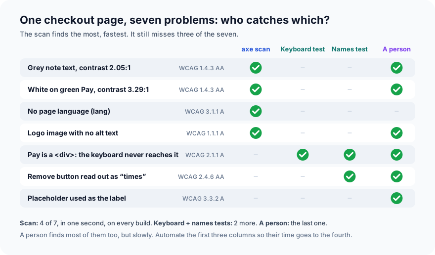
That's the shape of accessibility testing in one picture. The scan is fast, so run it on every build. It found four of the seven in about a second. Two short tests of your own found two more. A person found the last one, and a person is also the only one who can tell you whether the page is actually pleasant to use with a screen reader, which no test checks.
Step 5: Fix them and run again
Every fix is small:
-<html>
+<html lang="en">
-    .note { color: #b5b5b5; font-size: 14px; }
-    .pay { background: #16a34a; color: #fff; padding: 12px; text-align: center; border-radius: 8px; cursor: pointer; }
+    .note { color: #6b7280; font-size: 14px; }
+    .pay { background: #15803d; color: #fff; padding: 12px; width: 100%; border: 0; border-radius: 8px; font: inherit; cursor: pointer; }
-  <img src="logo.png" width="120" height="40">
+  <img src="logo.png" width="120" height="40" alt="FoodNow">
-  <input id="tip" type="number" placeholder="Delivery tip (0 to 200)">
-  <button class="remove" onclick="document.getElementById('tip').value=''">×</button>
+  <label for="tip">Delivery tip (0 to 200)</label>
+  <input id="tip" type="number" min="0" max="200">
+  <button class="remove" aria-label="Remove tip" onclick="document.getElementById('tip').value=''">×</button>
-  <div class="pay" onclick="pay()">Pay 500</div>
-  <p id="status"></p>
+  <button class="pay" onclick="pay()">Pay 500</button>
+  <p id="status" role="status"></p>
lang="en"tells a screen reader which language and pronunciation to use.- Darker colours: a slightly darker grey and a slightly darker green both pass 4.5:1, and the design looks almost the same.
alt="FoodNow": the logo now has a text alternative. A purely decorative image would getalt=""instead, so screen readers skip it.- A real
<label>that stays visible while you type. aria-label="Remove tip": the button still shows ×, but is announced as "Remove tip".- A real
<button>for Pay. This one change makes it reachable with Tab, pressable with Enter and Space, and announced as a button. Use the native element and you get all of that for free. role="status"on the message, so a screen reader announces "Order placed" without the user having to go looking for it.
Run the same command again:
...                                                                      [100%]
3 passed in 1.24s
A 10-minute manual check for every new page
The tests now guard against these bugs coming back. For anything new, spend ten minutes as a person:
- Keyboard only. Unplug the mouse. Tab through the whole page. Can you see where focus is at all times? Can you reach, use and leave every control, including menus and pop-ups?
- Zoom to 200%, then 400%. Does text reflow into one column, or does it overlap, cut off, or make you scroll sideways?
- Screen reader for two minutes: NVDA (free) on Windows, VoiceOver on Mac and iPhone, TalkBack on Android. Listen to the form. Does every field say what it is? Are errors read out?
- Headings. Do they form a sensible outline (one
h1, thenh2s)? Screen-reader users jump between headings to skim. - Errors. Submit the form wrong. Is the error in text, not only red colour, and does it say how to fix it?
- Moving things. Anything that moves, blinks or scrolls by itself for more than five seconds needs a way to pause it, and nothing should flash more than three times a second.
Common mistakes
- Trusting a green scan. "axe found nothing" means "axe found nothing it can detect". As we just saw, it can miss the bug that stops a keyboard user from paying.
- Adding ARIA instead of using native elements.
<div role="button" tabindex="0">plus key handlers is more code and more ways to get it wrong than<button>. The first rule of ARIA is: don't use ARIA if a native element does the job. - Testing once, at the end. Accessibility fixes are cheap in a component and expensive across 200 finished pages. Put the scan in CI from the first page.
- Fixing the tool's list and calling it done. Users with disabilities are the real test. If you can, include them in usability sessions.
Put it in your pipeline
The scan test is an ordinary pytest test, so it runs wherever your other tests run. In a real suite, scan every important page and every important state: the menu open, the form showing errors, the modal on screen, because axe only sees the page as it is at that moment. Many teams fail the build on serious and critical problems, and report moderate and minor ones without failing.
What's next
In Part 2 of Testing in Practice we test an API with Postman, then run the same collection from the command line with Newman, so it can run in CI.
ProvaLab's QA agent can do the automated part for you: ask it to check a page's accessibility and it writes an axe-core test like the one above, runs it in a real browser, and reports the WCAG A and AA problems by impact. The keyboard check and the person with a screen reader are still yours. See the agent in the two-minute product tour.
See ProvaLab working on a real app
Your coding agent runs the tests, reads the failures and fixes them.